Singu

Singu

BeautyTech (acq. Natura)

BeautyTech (acq. Natura)

Turning a referral screen into a growth channel

Turning a referral screen
into a growth channel

Rebuilding the invite experience of Brazil's largest at-home beauty app, from the share button to the first booking

My role

Product Designer

Timeline

2 months

The Challenge

The Challenge

The referral screen overwhelmed users with competing CTAs and dense text blocks. No clear hierarchy meant users couldn't quickly understand how the program worked or what action to take first. Credit balance and referral status were invisible, leaving users with no sense of progress or reward.

The referral screen overwhelmed users with competing CTAs and dense text blocks. No clear hierarchy meant users couldn't quickly understand how the program worked or what action to take first. Credit balance and referral status were invisible, leaving users with no sense of progress or reward.

Jobs to be done

Jobs to be done

The key user tasks the new interface needed to support.

Invitation

Invitation

Invited users should be able to easily share their referral code with their friends.

Sharing

Sharing

Users should be able to quickly invite people from their social networks.

Tracking

Tracking

Users should be able to see who they have invited in the past and track their total referral rewards.
Goals

Goals

After identifying the issues that were harming users, we decided to define goals that would guide the project so that all collaborators were on the same page.

Help users

Help users

Easily share the invite link with your friends and family

Help Singu

Help Singu

Increase the number of referrals, making the experience fun, dynamic, simple and scalable.

Help Growth

Help Growth

Optimize your Refer & Earn program for business growth and make it the #1 acquisition channel

The Solution

The Solution

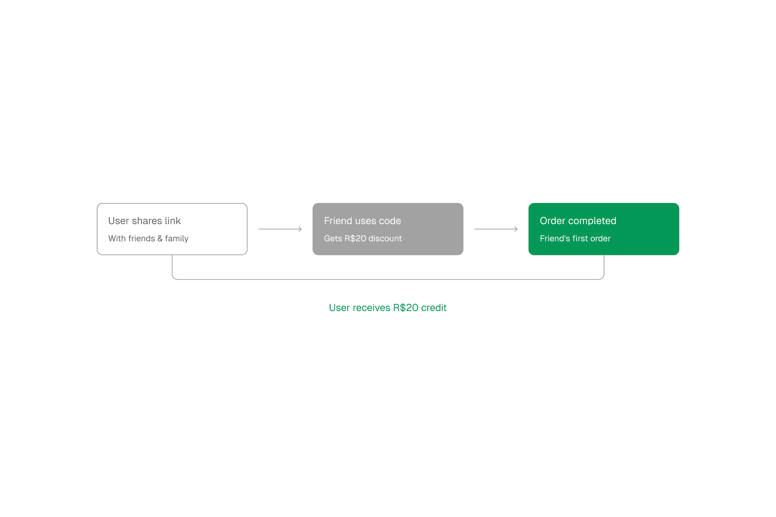
Your credit, before the rules. Balance, value per referral and invites in progress, visible the moment the screen opens. One link, one tap. WhatsApp first, because that is where invites happen in Brazil. Native share second. The exchange as three steps. What you get, what she gets, when it lands.

Your credit, before the rules. Balance, value per referral and invites in progress, visible the moment the screen opens. One link, one tap. WhatsApp first, because that is where invites happen in Brazil. Native share second. The exchange as three steps. What you get, what she gets, when it lands.

What i did

What i did

Moved the hardest decision out of the sender's hands.

Moved the hardest decision out of the sender's hands.

The old screen made you choose between inviting a customer or a professional before writing a word. That is the question the sender is least equipped to answer fast, and two buttons at that moment is a reason to give up. One link now, with the question moved to the landing page, where the person who clicked has context and can afford one extra step.

Put the earned credit at the top, as a balance.

Put the earned credit at the top, as a balance.

A referral program is a promise until you can see what it already paid you. The old screen explained rules and never showed the number. Leading with the balance makes the credit something the user owns, and gives her a reason to open the screen again.

Rewrote the program so both sides understood the same thing.

Rewrote the program so both sides understood the same thing.

The person receiving the invite was landing on a product she had never heard of, with a discount she had to take on faith. I rewrote the screen copy, the message that gets sent and the landing page so the same three facts appear in the same order everywhere. Value before conditions, plain words, short sentences.

Turned the rules into a sequence instead of three cards.

Turned the rules into a sequence instead of three cards.

Three cards of equal weight ask you to compare. Three numbered steps ask you to follow. You share, she gets R$ 20 on her first booking, you get R$ 20 when it completes.

Gave the section a visual language of its own.

Gave the section a visual language of its own.

The original looked like a settings page with coupons on it. The credit card became the hero, everything below it stayed quiet, and small motion on copy and share confirms the action without a modal. On a screen whose only job is one tap, that tap has to be the most obvious thing on it.

What happened

What happened

The redesign never reached users. Singu was acquired by Natura and the app was sunset in favour of Bluma before the work shipped.

The redesign never reached users. Singu was acquired by Natura and the app was sunset in favour of Bluma before the work shipped.